Guyss again, it's time for my favorite thing ever - judging book covers! We're gonna pick which versions are the prettiest ❤️ and which versions should be burned because of the pain they caused our eyes 🔥😊 Each cover will have it's publisher and (language) written below.
The topic of today's aesthetic judgment:
Legend by Marie Lu
Starting off strong, here are the OG English versions:
Personally, I'm a fan of the left one simply because I hate metallic covers/elements/anything 😂 Idk why, but I find it so old and cringey looking, but that's just me. They are fairly similar, with just the minor stylization differences.

Văn học (Vietnamese) and BhumiProkash (Bengali)
Omgosh, I'm sorry but I am absolutely terrified by the Vietnamese cover. It's too creepy and if I saw this on a shelf, I'd think it's some horror story about politics in America...which I now realize is not far from the truth, actually 😂😂 This book does talk about how the futuristic American government is doing nasty stuff (like most dystopian novels) but it still doesn't require such a dark cover 😵
The Bengali cover on the other hand features a sort of comic book art style, which is not that bad. I like the colors, and the symbol is there so it still has that main element. I don't love it, but I like it a lot, especially the way Day is drawn.

ASA (Portuguese) and Mizan Fantasi (Indonesian)
I mean, the Portuguese version is not that bad, but the background is a bit too much for me. I appreciate the thought and desire to switch things up a bit from the OG, but maybe if it wasn't that saturated? Idk, I can't focus on the title when this fiery void is screaming at me 😂
It's safe to say the designers behind the Indonesian cover spared no effort - they put on everything. There are the main characters, some random building, dramatic sky, floor on fire, some weird vague structure on the left...I honestly don't know what to say 😂 It's giving early 2000s photoshop and not in a good way 😂

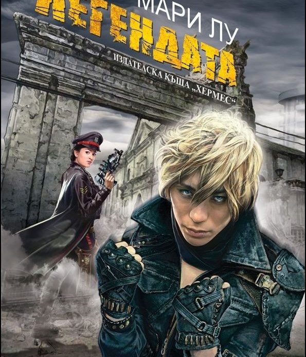
პალიტრა L (Georgian) and Хермес (Bulgarian)
Hmm, I like the color scheme for the Georgian one, it gives off dystopian vibes. I also like the background, but maybe it would have been better without the blurry silhouette 🤔 With it, it kinda looks like the guy is pondering life or overcoming some tragic events. Compared to some of the others, I don't mind this one, it's just okay.
The Bulgarian on the other hand..I mean...wow. The demon eyes guy is staring into my soul, and why does he look like he's gonna drop the most emo-sounding song ever? June might even be worse. What's with that outfit and weird gun??? I can't guys, I just can't.
I'm not gonna put a poll this time because it's messing with my post layout, and everything goes haywire. If you want to cast your vote on best/worst covers, you're gonna have to drop a comment below! 🥰

💬 Which cover do you think is best, or worst? 💬


2 Comments
Not the "horror story about politics in America" 😭😭😂 That's too real these days. Which is sad because this is a fictional dystopian book 😬😂
ReplyDeleteAs for the covers, I can't say I really like any of them? Maybe the second one, the one you don't like 😂, because it looks sleek. Though to be fair, I haven't read the book, so I'm not a good judge at what cover matches the story best lol.
It's horrifying and I'm so glad I don't live in America these past few years 😅
DeleteI can agree that this wasn't a very...satisfying batch 😂 oohh I definitely recommend this series, it's not very long put it's got a lot of good stuff 😄 Although, it's been ages since I read it so maybe I was just young 😂