

Guyss it's time for my favorite thing ever - judging book covers! Each time, I'll pick either a book series or multiple standalone books and show you their various cover editions. Then we're gonna pick which versions are the prettiest ❤️ and which versions should be burned because of the pain they caused our eyes 🔥😊
For my first post, I chose a trilogy that most of the world (including me) has read and loved:
The Winner's Trilogy
I'll always start with either the OG covers or the covers that the books are most famous for. All opinions are just my personal preferences and if you like covers I hated (or vice versa) feel free to say so in the comments! I'd love to see which elements you loved, or which colors spoke to you, or whatever you wish to share! Both reading and aesthetics are subjective experiences, so we don't have to agree on everything to have a good time judging the hell out of these covers 😂

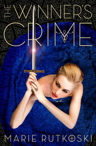
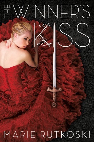
Now these are just fine. Honestly, if it weren't for nostalgia, I'd probably consider them slightly boring. The thing is, these covers don't give the right vibes in my opinion - it's a far more complex, deadly and scheming series than these covers convey. For that exact reason, I avoided reading this till a few years ago. And yet I can't say I'd burn them because whenever I think of this series, these covers pop in my mind. 😂♥


I'm sorry if you like this, but IMO this is horrible 😂 Idk what's worse, the bad photoshop, the wildly different outfits or the color choices...I'm gonna say burn it. 🔥


If you Googled "YA fantasy novel" you'd get something like this - the most basic thing ever.

It's too similar to everything else so I'm sorry Germans, but I'm gonna burn it! 🔥


Now this is far more badass and fitting of the series! While it has some "basic" elements, like the dagger and crown, it gives a bit of a darker vibe - more serious, if you will. I'd definitely show these off if I had them on my bookshelves. Love it! ❤️


If Vogue existed in The Great Gatsby, I guess this is what it would look like. It doesn't fit the story at all, and the color choices are bad. I'm familiar with YA Vulkan, and they usually have much better cover designs, so I have no idea who let this happen. Burn it! 🔥


*drools while staring with loving eyes*
I had no idea these existed and now my life is changed forever. These are absolutely stunning!!! ❤️ The art style, character design, even the patterns behind. I love every single thing about these.
Now it's time to vote for your favorite!
That's all for today. I absolutely loved this and you bet I'm gonna make a sequel soon!

💬 Which genres are out of your comfort zone? 💬


6 Comments
I love this idea! Years ago, I had a different blog, and I did this as well. It is so much fun and I loved seeing how different certain covers were.
ReplyDeleteWhat I don't like is when there are multiple (and I mean multiple) covers in the same language (like Winner's Kiss also has an edition with the green dress, I guess the paperback), because most of the times, they are reprints and the old ones are way more difficult to get.
Though the original ones are a classic for me, realistically, they're not the best ones. I hate this trope on covers, but it works so well for book 1. I guess the colors, dress and the title help. I tried getting them a couple years ago and every time I checked, it was the ones by Square Fish...
German ones are really pretty, but a bit basic, and it feels more aggresive than what the series actually is. I think my favorites are the Czech ones, because, even though they are basic, they convey the feeling of the series the best. They seem minimal but they have enough to give you clues about what the books are about. I agree with what you say about the Serbian ones.
The new ones by Bloomsbury are beautiful! I saw them some time ago and I was surprised! I don't know if it is a special ocasion or a normal one, but they're very nice! My only issue is that I'd prefer it as a card or as some merch, because there are a lot of similar-looking ones in special editions. I think that having that style, which is stunning, with some scenes from each book as a bookplate or merch, it would be great.
Ohhh then you have to do it again! If you have time of course 😅 I'd love to read it and judge covers with you 😂
Deleteomgosh same! It's so annoying when you can't have the whole series in one design (or even size!) and it's mismatched. I did see the one with the green dress while researching and I was so confused, I didn't know if it was a reprent or something else.
I agree about the Czech ones! It's like they took the usual fantasy elements, but twisted them enough so it looks and feels original + connects to the story real well.
You know what, you're right. I forgot that all the bookish merch and fanart comes in that "Bloomsbury" style 😂 I don't have any special editions at home (nor are they easily available in my country) so I keep forgetting they exist, and now that I think back, most of them look kinda similar to this.
They all are beautiful!! It was soooo hard to just choose one!!
ReplyDeleteI've chosen the fourth one but it was almost a tie with the last one, because both are quite amazing!
ahh I feel you, there were truly many gorgeous covers 😍
DeleteOmg I'm totally with you on the YA fantasy novel covers... why do they all look the same??? 😭 Daggers and flowers? Give me something different! Something with personality! Come on! 😭 Anyway, this is such a fun post idea!
ReplyDeleteYesss! I can't even differentiate them anymore. I used to know exactly which book series is which just by the color scheme. Now I have to read the title and even then it can be confusing with all the "the something of something and something" 😂😅And thanks! 😄
Delete