

Guyss again, it's time for my favorite thing ever - judging book covers! We're gonna pick which versions are the prettiest ❤️ and which versions should be burned because of the pain they caused our eyes 🔥😊 Each cover will have its publisher and language written below.
The topic of today's aesthetic judgment:
Skyward Series by Brandon Sanderson
Before I get into the covers, quick update - I'm going to Italy today!!! Ahhh super exiteddd 😍 That means I won't be able to post (or reply to your comments) until Monday when I get back. I've been dying to go on this trip for years, and now it's finally happening 👀 Back to the topic!
I'm sorry to disappoint and say that I still haven't finished this series despite rating the first 2 books 5 stars 😅For some reason, while I waited for the third book, I kinda lost interest because I forgot half the plot. I think I'll have to do a reread in winter because I remember liking it and I know objectively that it's an amazing series...I just need to find the time and the will to reread it first lol. As usual, I'll start with the English covers (the one I personally read) and move on to other languages.


◇─◇─ Gollancz (English) ─◇─◇
Seeing these covers is what made me pick up the first book; it's a freaking MASTERPIECE. Look at the color choices, look at the borders, look at all the details. I couldn't have asked for a better representation of what a sci-fi fantasy novel should look like. The covers themselves tell a story and give you a glimpse into the atmosphere of the novel. Whoever designed this, I hope his pillow is always cold, and his wi-fi never stops working ❤


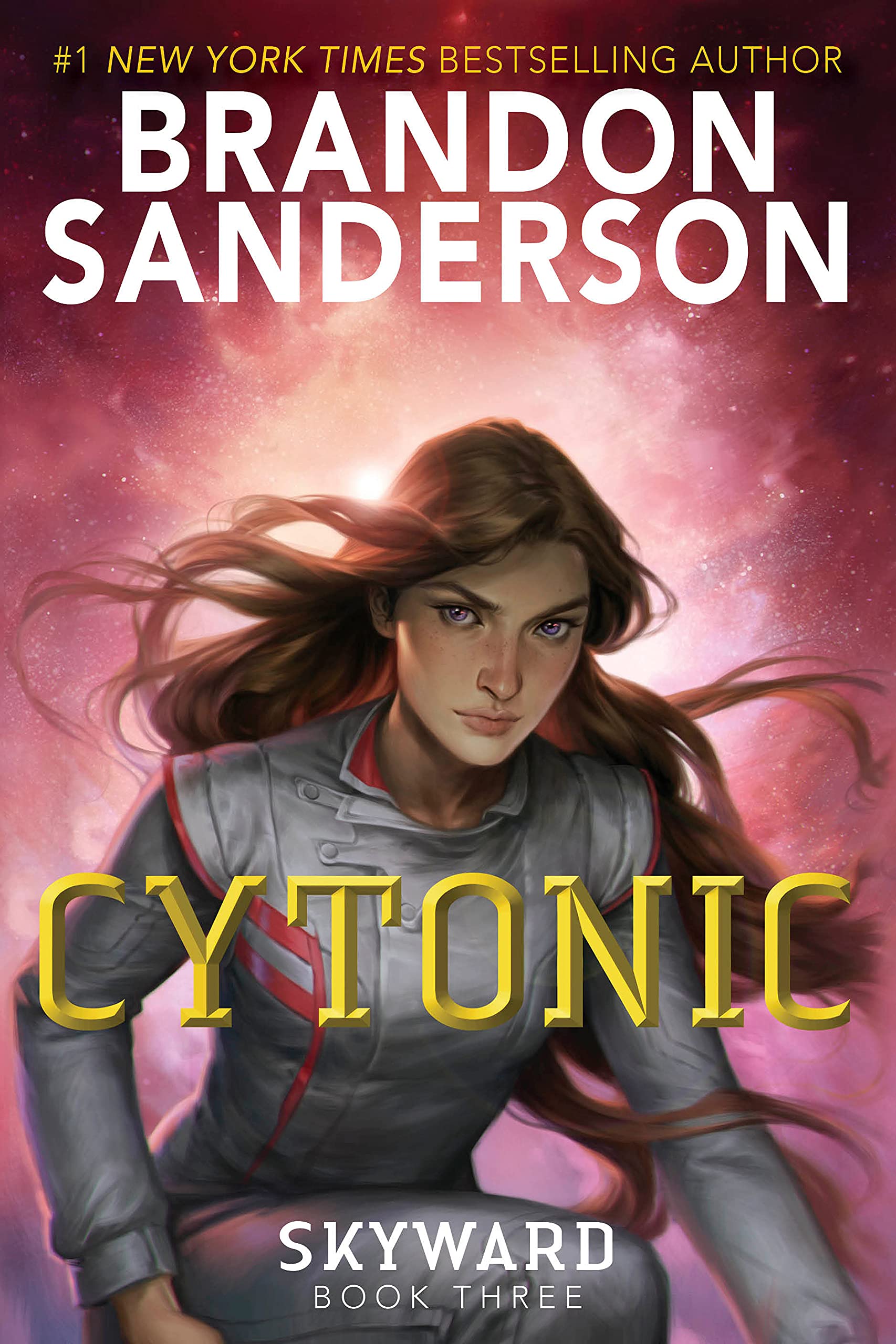

◇─◇─ Random House Children's Books (English) ─◇─◇
Look, I appreciate the artist because drawing people and faces makes me wanna jump from a building BUT...aside from the pretty background colors and drawing skills, what do these covers have? The main character looking forward or slightly to the right?

Nothing jumps out as unique or as something specific to THIS story. It's just a generic female main character on all 4 covers, except maybe on the first book, I can see *shocked gasp* details in the background...


◇─◇─ Artline Studios (Bulgarian) ─◇─◇
Now this, this is something I can get behind. It's got a similar art style to the last batch, but it actually contains multiple elements - you've got the spaceships, the helmet, the ongoing battle, a hangar etc. Despite sharing the same base - MC is a pilot - each cover does a unique spin on it. And I can actually tell from these covers that this is an epic sci-fi story. Loving this!!


◇─◇─ Fantaasia (Estonian) ─◇─◇
I can see the vision, there are definitely some fun elements here, but what happened to the third book? Why is there suddenly no background? Also, I'm sorry to my Estonian designer friends, but can you please use different fonts, because this one is giving nothing 😅

Also, idk who scared you guys and made you switch from epic space scenes to drawing a super detailed girl drifting in a purple abyss, but please, don't listen to them because that first cover is so BADASS I wish you stuck with that style.


◇─◇─ Librairie Générale Française (French) ─◇─◇
What is it with the third book that makes everyone switch styles? 😂 Although, I have to admit, in this case I'm actually liking that one more than the rest...I think it's because the girl is drawn in a very detailed, unique way, while the second and fourth covers look like literally every sci-fi novel out there.
The first cover is also interesting because they took the plot of the book and drew exactly that, which I love. I think I like covers 1 and 3 because they both have something that immediately jumps out, while 2 and 4 are just...there. They do have spaceships and a floating city (which is cool duh), but the colors and perspectives make it all look so...unimportant. Maybe if they zoomed in on the city and made, like, half of the cover just that, so you can see individual buildings and stuff, that would've been cool.
Also PLEASE remove that hideous publisher red sticker, it's ruining everything, thank you.


◇─◇─ Knaur TB (German) ─◇─◇
I've never been so disappointed and delighted at the same time...LOOK AT THAT FONT. I'm in love with this typography, but why, oh why are there floating faces in space?? Didn't we leave that in the early 2010s??? Even the color schemes for the backgrounds are nice, but couldn't they have at least drawn a planet or a spaceship somewhere?



◇─◇─ Zysk i S-ka (Polish) ─◇─◇
These. Are.STUNNING. Honestly, if it weren't for this weird blur/desaturation effect on the first cover, this would be absolute perfection. Not only did they draw these amazing, super detailed scenes, but the titles look like Star Trek had space sheriffs or something like that, and I'm all here for it!!!

I wish I knew Polish because having these on my shelves, especially the third and forth one, would be bliss.


◇─◇─ Zysk i S-ka (Polish) ─◇─◇
The designers over in Poland obviously never sleep because the same publisher also made these 😂 While they're not necessarily my style, I appreciate that they chose these usually male-led action-movie designs for a YA book about a girl space pilot - that's a rarely made move, so kudos for that!
And someone there is obviously a Star Trek fan because look at that pilot chair (and the badge on the first one)!!! I see you Poland designer; I see you and I want to high-five you! 😂
Phew, that was a lot of designs! Honestly, this is the first time I'm not actually hating on any of them 😂 Obviously, some were better, but the ones I didn't like are just meh, nothing overly dramatic. I think my faves would be the Gollancz edition, the Bulgarian and that first Polish edition - the attention to detail is off the charts in those 😍

💬 Which cover do you think is best, or worst? 💬








4 Comments
English A I think is the best version - the imaginary is intruging and the stark colors works really well. The Bulgarian ones were also good. The German ones was kind of scary with the eyes - for some reason, I'm thinking horror.
ReplyDeleteHave a lovely day.
I definitely agree! The black background with yellow details delivers a striking aesthetic 😍 The German designers need to rethink their future in graphic design lol You too!
DeleteI love the Bulgarian one - very quintessential sci-fi YA! :D
ReplyDeleteThat's a spot on assessment! Love it 😍
Delete