

Guyss again, it's time for my favorite thing ever - judging book covers! We're gonna pick which versions are the prettiest ❤️ and which versions should be burned because of the pain they caused our eyes 🔥😊 Each cover will have it's publisher and (language) written below.
The topic of today's aesthetic judgment:
We Were Liars by E. Lockhart
As usual, I'll start with the English cover (the one I personally read) and move on to other languages.
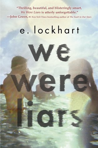

Delacorte Press (English) / / De Agostini (Italian)
When I first saw this book many years ago, I didn't think much of the cover. because I'm the type of person who hates when people are on the cover. I mean, it does convey the fact that this is set during summer and there are partying teens involved + the font is slightly mysterious/creepy so you could say it fits. Still, I don't have any special emotions towards it, but for nostalgia's sake, I'd rate it 7/10.
The Italian one on the other hand...please, no. This is not a summer rom-com about finding meaning while strolling on the beach!! Also, that font doesn't go with the background at all. The photo is all summer cozy vibes, and the font is "crime documentary about a serial killer." BURN IT.

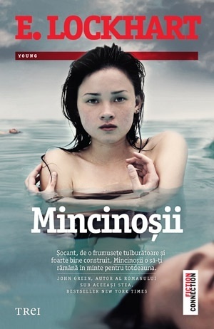

Editura Trei (Romanian) // Seguinte (Portuguese)
The Romanian cover definitely sets the right tone, but I think it gives away slightly too much. The book is supposed to shock you, make you think everything is fine, and that you already know everything when in fact you don't. Still, compared to others on this list, this is a solid cover.
If you want a previously undiscovered One Direction album art, pick up the Portuguese cover because what in the 2000s music scene is this?? The blur, the whiteness, the clothes...Horrible.


Ravensburger (German) // المركز الثقافي العربي (Arabic)
The ONLY good thing about the German cover is the creepy summer house in the background. These close-up blurred faces are just ugh. Why? The colors are too drab, and there are more characters than just these two, so I don't see the point in putting them front and center.
I have to admit the Arabic one is intriguing. While I think the style is a bit too "self-help" book style with the thought bubbles and simplistic 2D drawing, the zipper is an interesting touch. I think the idea was good, but the execution could've been better. It's all about lying and how words can affect others so it makes sense. I just wish the drawing style were a bit different.
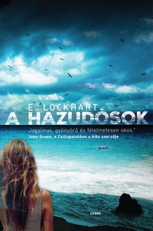

Ciceró (Hungarian) // Lavender Lit (Swedish)
While these "shipwreck" vibes don't fit the story, that's not the worst thing about this Hungarian cover - it's that obviously badly photoshopped girl. I can literally see where they used the blur tool and tried to make it all merge into a coherent image and yet failed spectacularly.
The Swedish cover had a competely different idea and not necessarily a better one. Although, now that I think about it, this cover has the same problem as the last one - the girl. If it weren't for her, this could've been an interesting cover. These pastel colors with that creepy house manage to actually convey the duality of the book - the happiness of the before, and the sadness of the after POV.
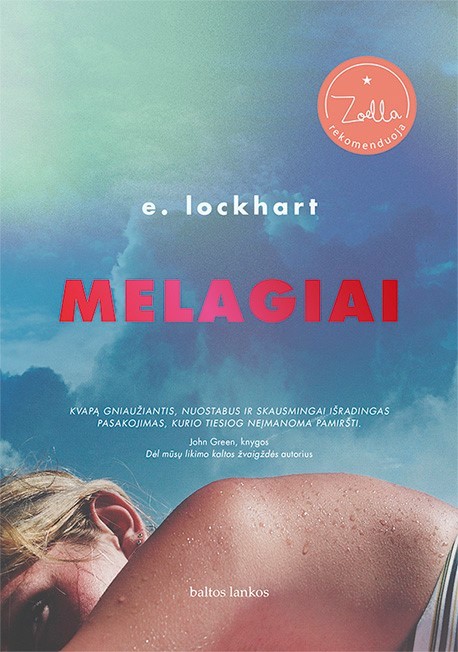
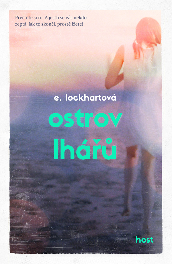
Baltos lankos (Lithuanian) // Host (Czech)
I don't have anything bad to say about the Lithuanian cover. While it's quite basic, the filter on the image and the pose actually remind me of something a young girl would post on social media in the early 2010s to show everyone how good her life is - which fits parts of the story so well.
For some reason, the Czech cover captivated me even more. There's sort of a haunting presence in this polaroid style filter on the image and I can't stop looking at it. The white border is also adding a lil bit of spice and honestly, the more I think about it the more I love it. It conveys a sort of sadness and nostalgia you feel when you look at old photos of things and people you use to know. Gorgeous ♥
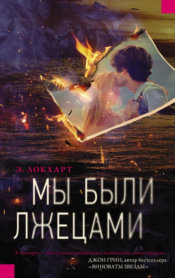
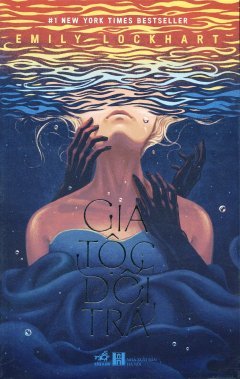
ACT (Russian) // NXB Hà Nội (Vietnamese)
Russian designers this is not a Turkish drama!! Why so extra? Also, again, only two people here and that's not the point of the story. Maybe if they removed the photo and just left the sea and smoke, it would've been better.
Now this, this is a work of art. Honestly, the Vietnamese cover might be my fave cover of all of these on the list. It's got gorgeous art style and the hands reaching for the girl from the depths of the sea (which is also her dress!!!) creating a creepy atmosphere - STUNNING.
To summarize, my favorite covers would be the Vietnamese and Czech covers while the English and Lithuanian ones would be second place.

💬 Which cover do you think is best, or worst? 💬


2 Comments
Not the One Direction album cover 😭 That one is my favorite... for all the wrong reasons 😆🤣
ReplyDeletehahahah I'm glad at least someone...."liked it"....😂😂
Delete